Wednesday, 11 April 2012

print elective

The final of the 3 electives I chose was print. The project brief was to look at how objects occupy space in the environment. I looked at my immediate environment- the print room, the college and the kitchen table at home, the places where I was spending most of my time. I took an interest in how manmade objects occupy the space in my environment in particular metal objects, specifically curved objects like the wheels on the printing presses and the curve of the aluminium sugar bowl that is always present on the kitchen table with the teapot.

Some photographs of the printing presses in the print room . . .
printing press wheels


More snapshots of the printing presses


and some photographs of the objects at the kitchen table-sugar bowl and cups . . .


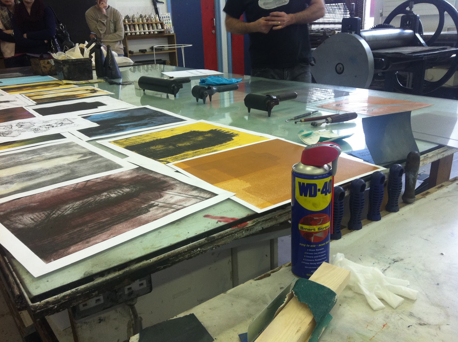
Print demonstrations from print tutor on drypoint etchings and mono print . . . .


Tuesday, 10 April 2012

Graphic design elective: Contextual research

I looked at a variety of typographical posters and designs to help inspire my own work.


graphics design part 2: illustrative-She ran like the wind

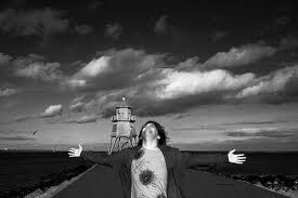
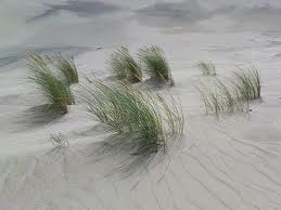
Week 2: This week our project brief was to represent the metaphor visually. The following are some images I looked at to help inspire this project.


I felt these images were way too stereotypical. Back to the drawing board again. I kept looking at the metaphor: 'She ran like the wind'. I needed to do a different spin on it. Plenty of preparatory work. Thumbnail illustrations playing on the phrase-'she ran like the wind'

This is my finished illustrative piece. The open door& domestic scene implies that she has left in a hurry. The blurry landscape  implies vagueness and uncertainty. The black interior leaves it open to the viewer as to why she has left.

This is my studio space at the end of the 2 weeks.


Graphic Design Elective February 2012

For my second elective I chose visual communications. We were given a metaphor to work from. Mine was 'She ran like the wind.' We had to represent the metaphor through typography alone. No imagery allowed.


The letters are made out leaves and wind is in BOLD pink ( to represent femininity /she)

mind mapping


The type is written in the style of a swirling hurricane  with the wind written in pink(she)

The contradiction of the type. The feminine script versus the bold speed script. I experimented by swapping the  type around.